Although there have been many other most used font posts, most of them outline fonts used by the ‘not-so-well-trained’ designer. In this article, we want to outline the fonts that are often used by the more ‘professional’ of designers.
The List of Commercial Graphic Design Fonts
1. Helvetica

Without a doubt, Helvetica is the most heavily used font by professionals (and also by the not so professional) in graphic design. Although some praise the font, many others believe that it is spaced too tightly.
Moreover, as a profesional graphic designer, you should aim to understand that you can’t always rely on Helvetica to demonstrate and deliver your every message. Helvetica is not perfect for everyone, every time.
2. Trajan

Trajan seems to find its way into many Hollywood movie posters as well as anything remotely to do with law, religion, marriage, class or the past.
A little bit of history on the font Trajan – Trajan is an old style serif typeface designed way back in 1989 by Carol Twombly for Adobe. The design of the font is based on Roman square capitals, as used for the inscription at the base of Trajan’s Column from which the typeface takes its name.
3. Garamond

There are many versions of the Garamond font, the most widely used version today; is the Adobe Garamond version released back in 1989, & illustrated in the image above. Garamond is an excellent font for magazines, textbooks, websites and long bodies of text and was recently named the second-best font (after Helvetica) by a German publication.
4. Futura

Futura is a font that very often used for large displays, logos, corporate typefaces as well as in books; where small text is needed. It is based on geometric shapes (circles, triangles and squares) which went on to represent the Bauhaus design style of 1919-1933. Futura has an impression of efficiency and forwardness.
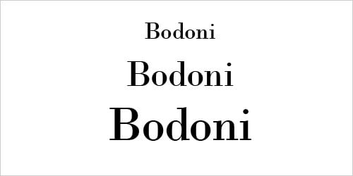
5. Bodoni

Bodoni is a great font for headlines, decorative text and logos. Bodoni has a narrow underlying structure with flat, unbracketed serifs. The face has an extreme contrast between thick and thin strokes and an overall geometric construction which makes it a very artistic looking font.
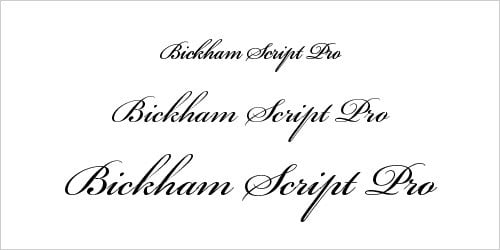
6. Bickham Script Pro

Used mainly for formal occasions, Bickham Script Pro is a font which does the job well – Cameron Moll even recommended it in his article “Typefaces no one will get fired for using.” The ‘not-so-trained’ designer usually vouches for Vivaldi instead which is one of America’s most hated fonts. Another great alternative would be Sloop.
7. Frutiger

The Frutiger font family is neither rigidly geometric nor humanistic in construction; its forms are designed so that each character is quickly and easily identified, this distinctness makes it suitable for commercial signage and display work.
The full font family has a warmth and subtlety that has, in recent years, made it a popular choice for the smaller scale of body text in magazines and booklets.
Contact ProCloud Signage About Graphic Design
Procloud Signage offers the best quality Graphic Design services to businesses & companies all over Brisbane. Our team of designers create outstanding, memorable designs that’ll make you stand out in the jungle.
Call 1300 722 659, Email info@Procloud.com.au.


